
AristaPoint — Bringing Clarity to a Complex Benefits Experience
AristaPoint's digital presence needed to communicate complex employee benefits information clearly while supporting a growing range of marketing initiatives and audiences. I designed and developed a more cohesive experience across web, marketing, and media—improving usability, strengthening brand consistency, and creating a more flexible foundation for ongoing content.
-
The Problem
Dense, difficult-to-navigate information
Unclear content hierarchy
Inconsistent brand and messaging
Disconnected web and marketing efforts
-
My Role
UX & Web Design
Front-End Development (Bootstrap, .NET)
Visual Design
Marketing & Media Production
-
The Approach
Restructured content around user needs
Established reusable design patterns
Designed and built responsive experiences
Unified web and marketing experiences
-
The Outcome
Clearer, more accessible benefits content
Greater consistency across touchpoints
25% increase in brand awareness
More flexible foundation for growth
Understanding the Challenge
AristaPoint operates in a space where complex employee benefits information needs to be communicated clearly to a range of audiences. As the company’s digital presence grew, information had become increasingly dense, making it harder for users to quickly understand key services, navigate content, and identify what was most relevant to them.
The challenge extended beyond the website. Marketing materials, digital campaigns, and other brand touchpoints had developed independently over time, creating inconsistencies in both visual presentation and messaging. The opportunity was to bring greater structure to the experience—making information easier to understand while establishing a more cohesive system across web and marketing.
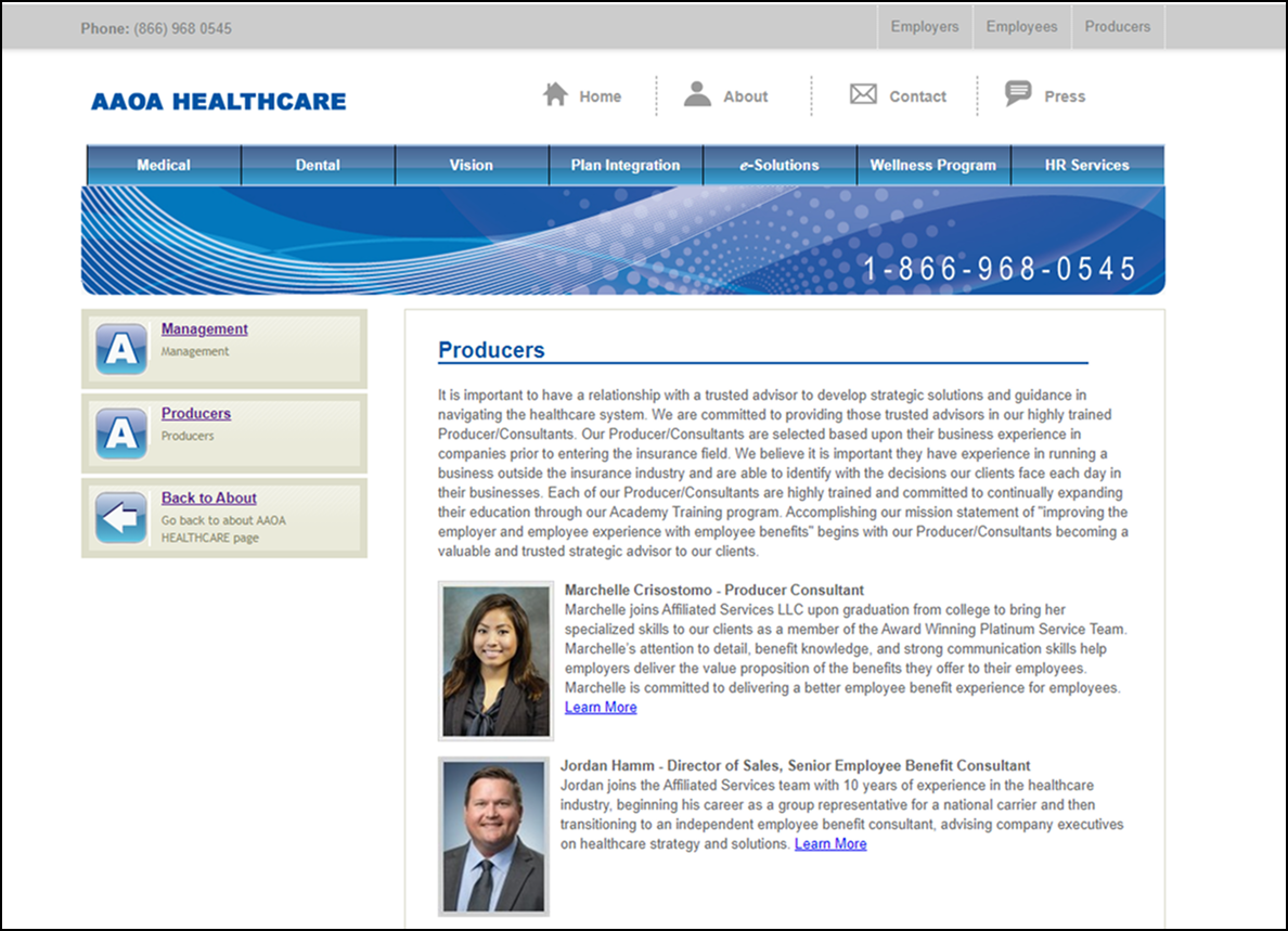
Legacy Website

Old Advertisement
Creating Structure
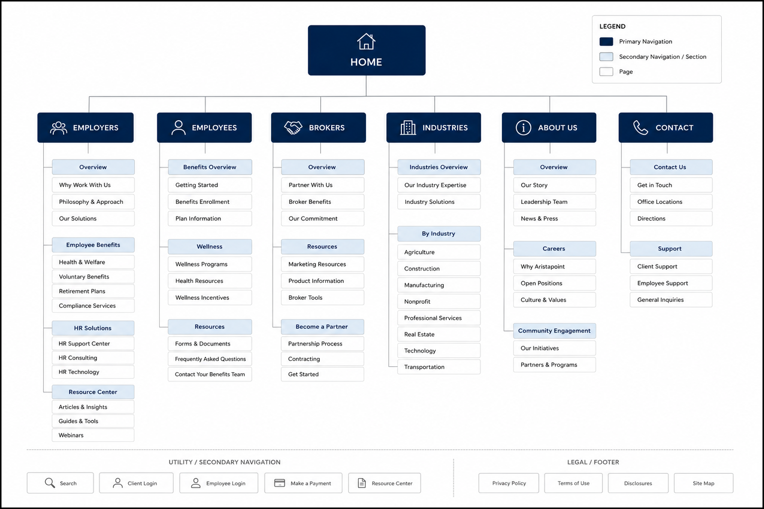
Simplifying The Information Architecture
Grouped related services and benefits information into clearer pathways, making the site easier to navigate.
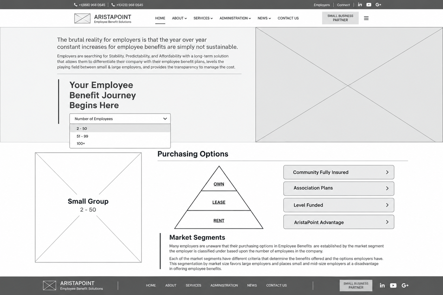
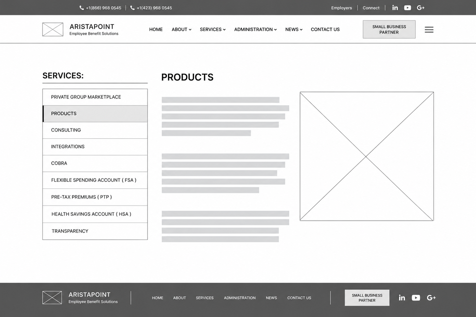
Establishing Page Hierarchy
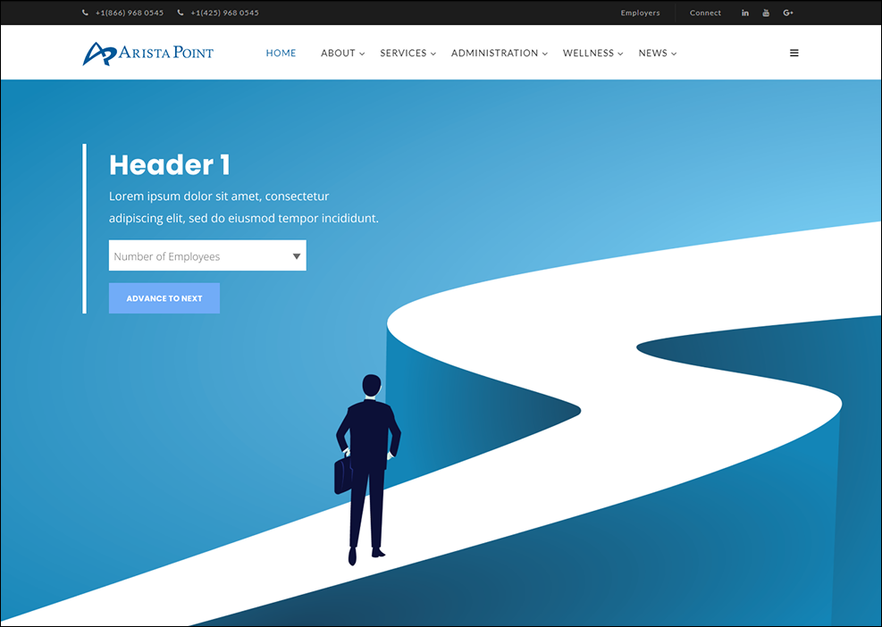
The homepage prioritizes employee count to guide visitors toward relevant purchasing options, while service pages pair contextual navigation with focused information.
Designing the experience
With a clearer structure in place, I translated the content strategy into a cohesive visual experience focused on clarity, hierarchy, and ease of use. Modular layouts and consistent design patterns helped make complex information more approachable while creating a flexible experience across pages and devices.
-
![]()
A GUIDED START TO BENEFITS EXPLORATION
The redesigned homepage gives employers a clear starting point: selecting their company’s employee count. That choice leads into an interactive overview of relevant insurance options, breaking complex benefits information into a more focused, manageable journey.
-
![]()
INTERACTIVE BENEFITS EXPLORATION
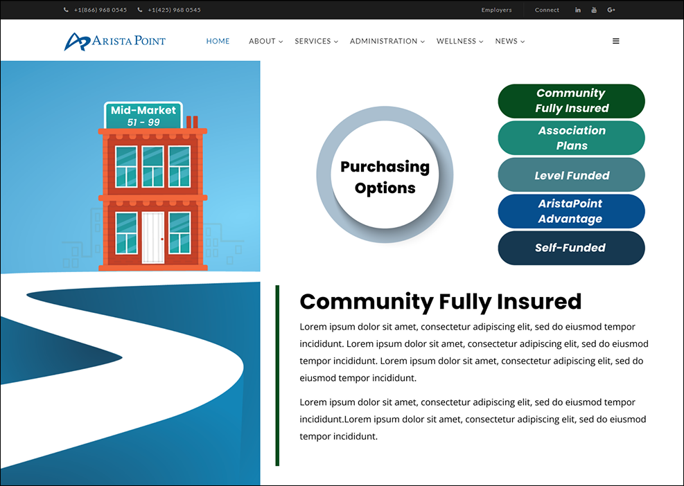
After selecting their company size, employers can explore relevant purchasing options through a clickable interface. Selecting an option updates the supporting information in place, keeping the available choices visible while presenting the details one plan type at a time.
-
![]()
CLEARER NAVIGATION, MORE VISIBLE EXPERTISE
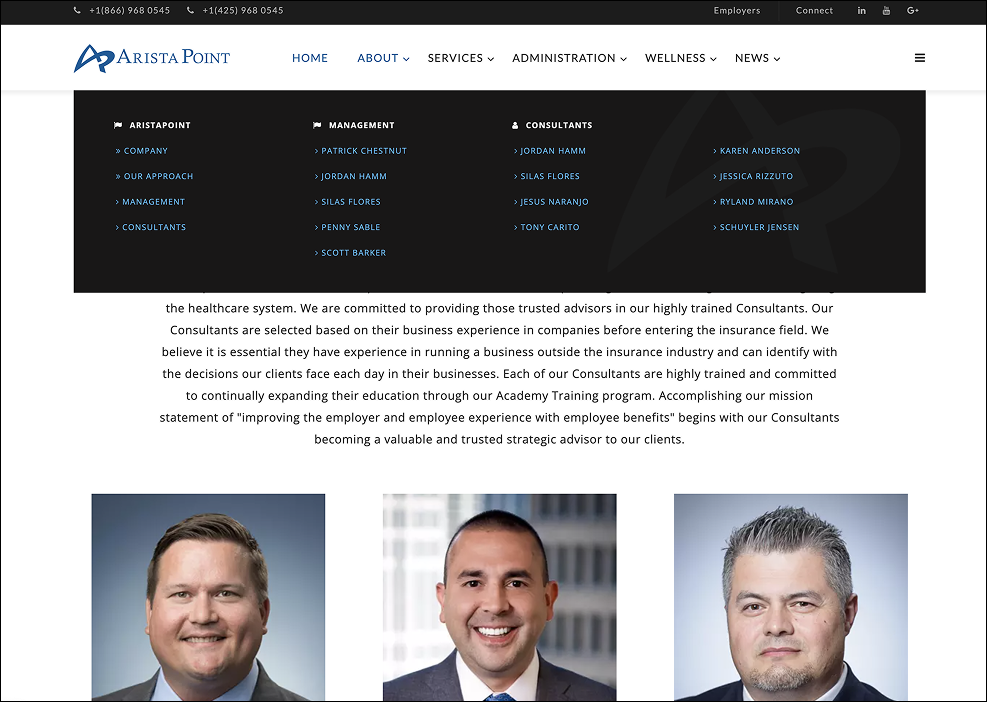
A grouped dropdown menu provides direct access to company information, management, and individual consultants. Below, a consistent portrait grid replaces the previous text-heavy listings, giving the team greater visual prominence and making individual profiles easier to browse.
I designed a dedicated landing page for clients to explore insurance products with AristaPoint’s producers in a smaller seminar setting. The layout introduces the program before organizing sessions into a consistent table of dates, cities, and venues. Registration actions sit directly alongside each session, allowing visitors to compare options and select the event that fits their schedule.
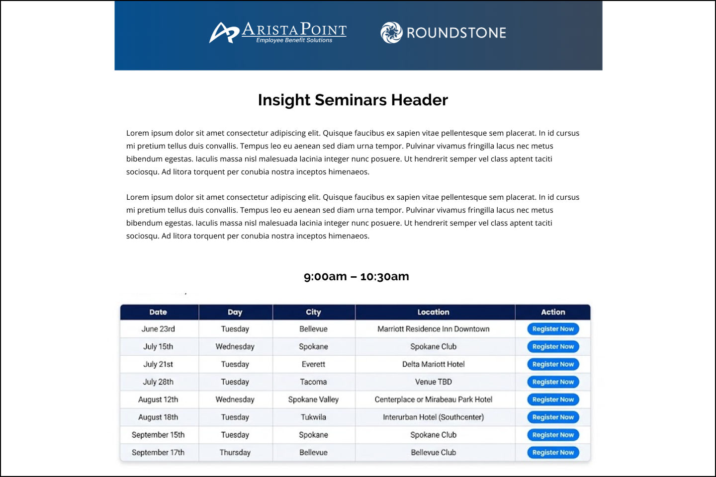
Seminar Registration Page
Company Overview
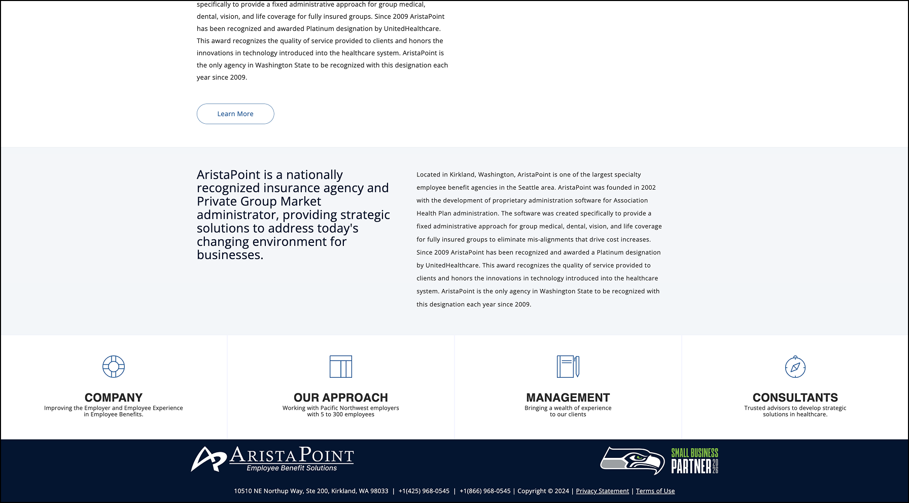
I organized the About page around a concise overview of AristaPoint, paired with supporting detail about its history and expertise. Contrasting type sizes distinguish the key message from the longer background content, while four clearly labeled pathways help visitors explore the company, its approach, management, and consultants.
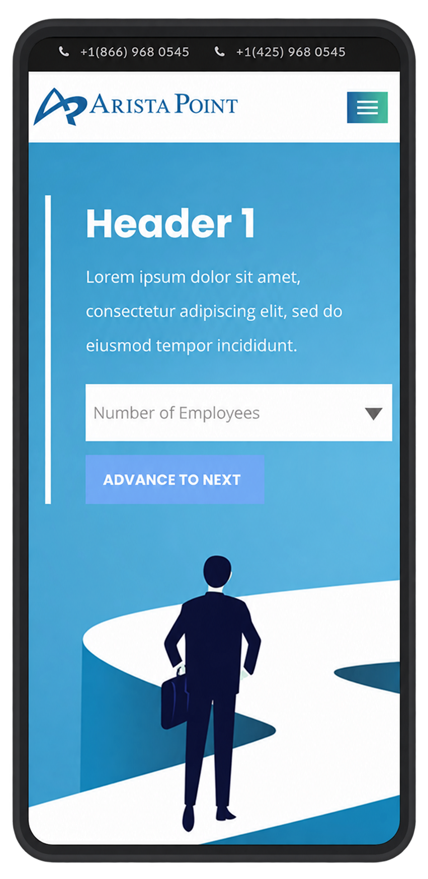
Mobile Home Page
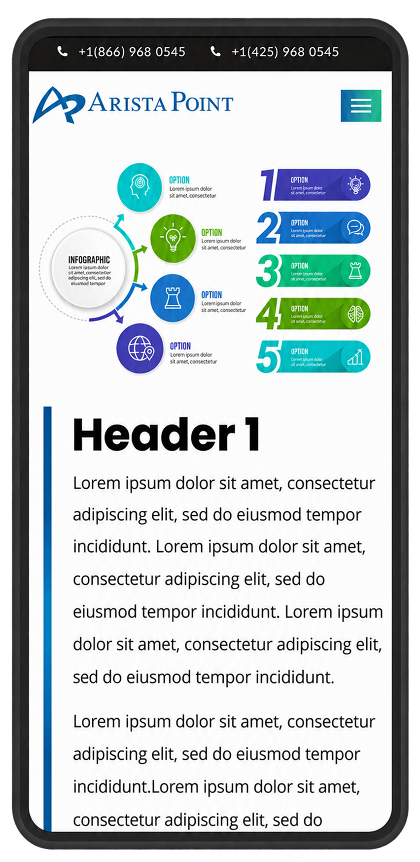
Benefits Information · Mobile Concept
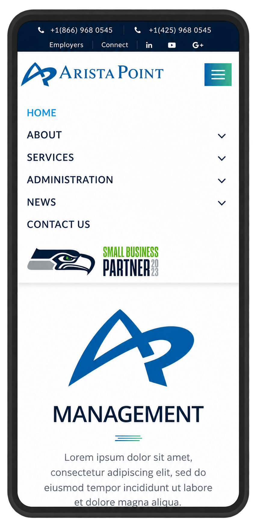
Mobile Navigation Bar
From Design to Development
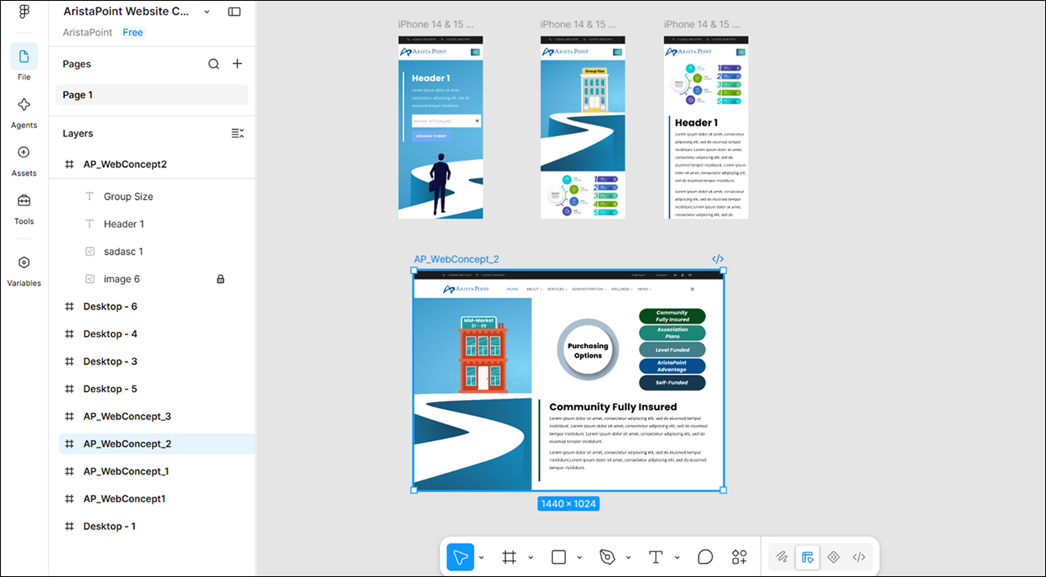
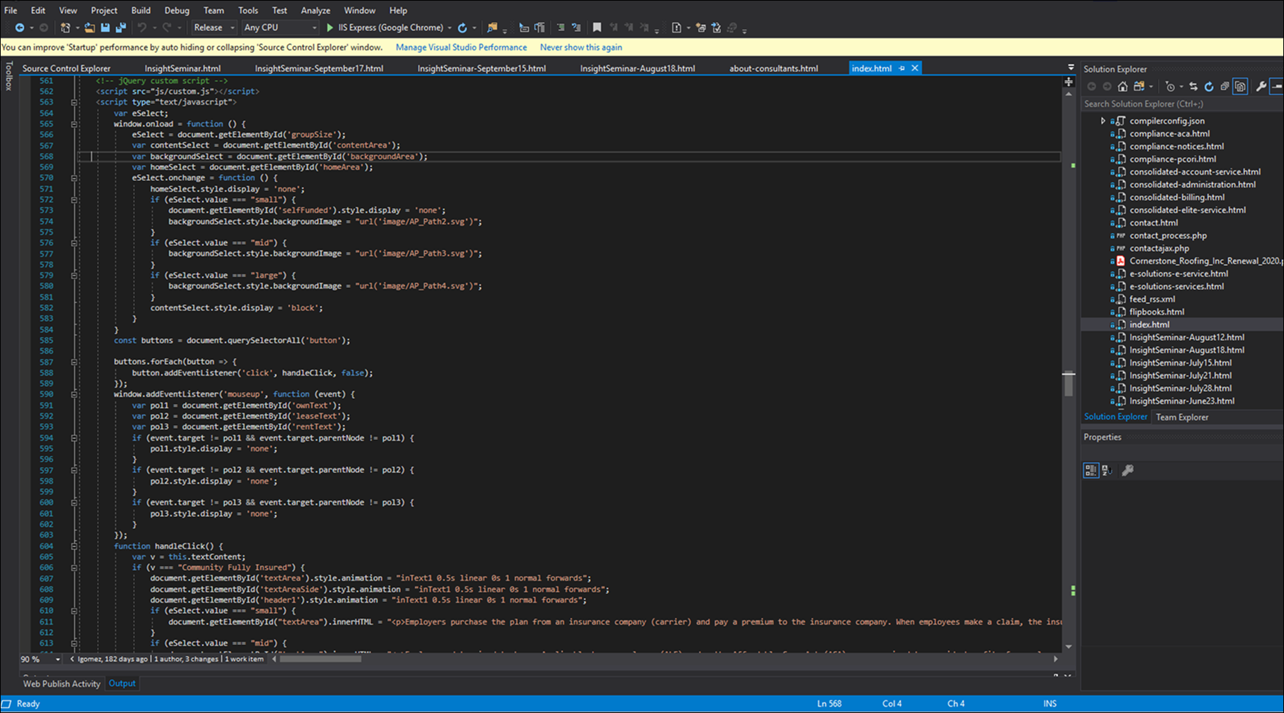
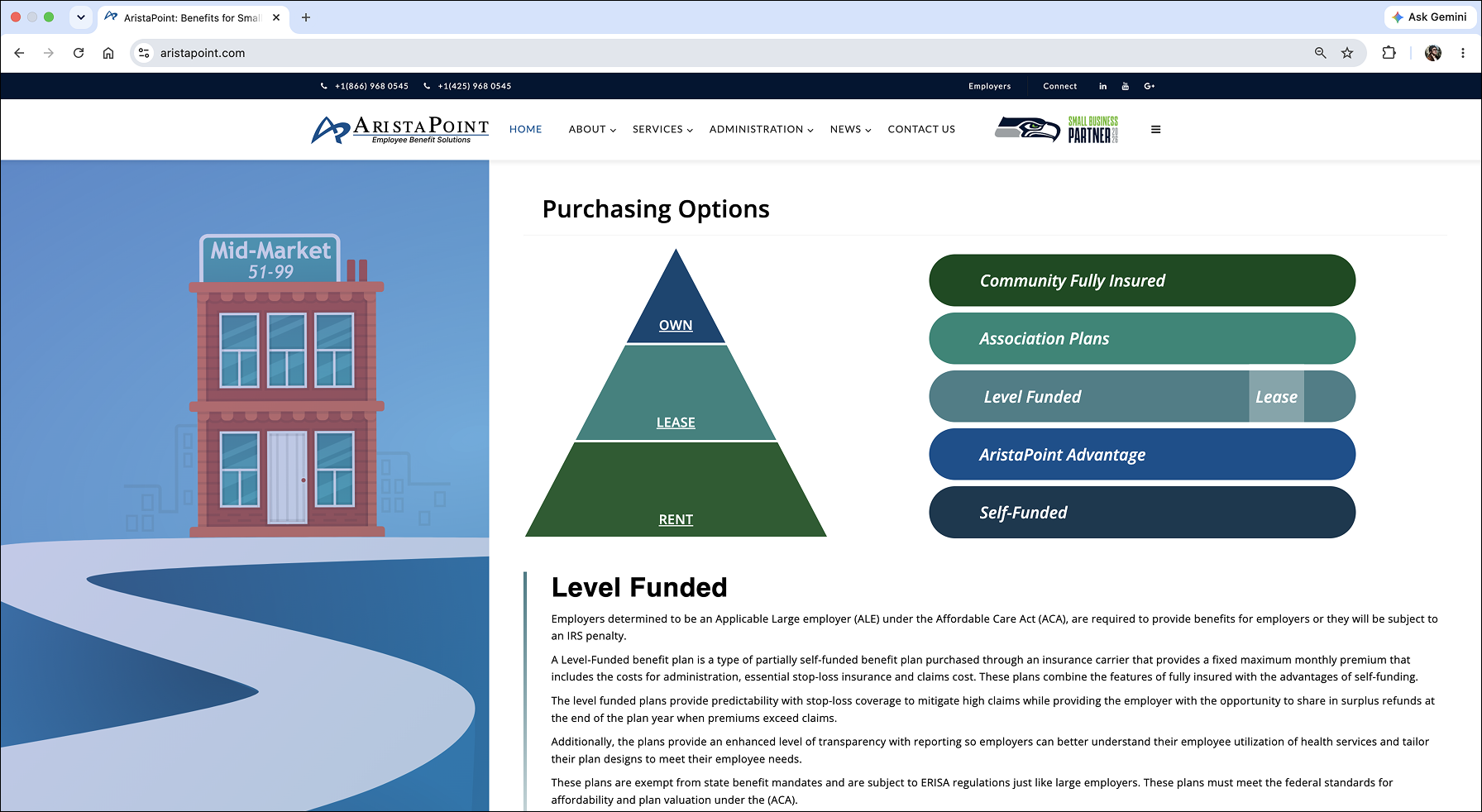
I carried the experience from design through front-end implementation, translating layouts and reusable patterns into responsive Bootstrap and .NET components. Working directly in the build allowed me to refine the experience as designs moved from concept to production.
-
![]()
DESIGN · FIGMA
Layouts established the hierarchy, content structure, and responsive behavior before development.
-
![]()
DEVELOPMENT · BOOTSTRAP / .NET
Designs were translated into responsive front-end components built to support reusable content patterns.
-
![]()
IMPLEMENTATION · LIVE WEBSITE
The final experience brought the system together across responsive layouts, content, and interactions.
Extending the Experience
The evolving digital experience became part of a broader effort to create greater consistency across AristaPoint's communications. I extended the visual language across marketing, advertising, video, and internal materials, creating a more cohesive brand experience across channels.
As a Seattle Seahawks Small Business Partner, AristaPoint had a natural connection to the commercial’s football theme. I used the parallel between teamwork in sports and business to make the brand’s approach more relatable, combining video editing and branded graphics to carry its visual identity beyond the website into a concise advertising format
Marketing & Branding

Trade show banner

proposal cover

benefits cover

Seattle Business Magazine: full page ad
The Outcome
~25%
INCREASE IN BRAND AWARENESS
The work helped establish a clearer and more cohesive digital presence for AristaPoint, making complex benefits information easier to navigate while creating greater consistency across web, marketing, and media.
Beyond the immediate redesign, the project created a more flexible foundation for the brand to evolve. Reusable patterns, responsive development, and a more unified visual language made it easier to support new content, campaigns, and business needs without starting from scratch.
By carrying the work from structure and design through development and broader brand applications, I was able to connect previously separate touchpoints into a more consistent experience.